
Choosing the Right Paint and Colour For Your Home – and some decorative tips too.
Painting is a quick and cheap way to give an old room a breath of fresh air or to facelift your entire house. Here you’ll find out all you have ever wanted to know about selecting the right paint and colours for your home – and we’ve thrown in some décor tips for you too!
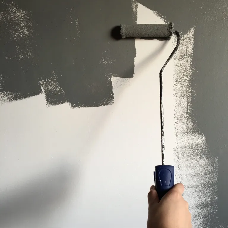
Which paint should you choose?
Paint comes in a variety of sheens as well as in either oil or water-based. Water-based paint is the most commonly and preferred paint type to use because of its ease of clean up and long-lasting durability. It also tends to be more fade resistant and breathes better than oil, resulting in less blistering of the paint. However, oil-based paint is great for priming wood mouldings and trim as it tends to seal stains and knots from the wood better than a water-based paint. It does take longer to dry than a water-based paint though, so plan for more drying time.
Which sheen should you select?
The glossier the paint, the easier it is to clean up. If you have small children and the room you are painting has high traffic, or tends to get grease on the wall such as in a kitchen, opt for high gloss sheen as you can easily wipe the wall down with a damp sponge. This will however make blemishes and imperfections in your wall more apparent and in rooms such as living rooms, could give off an unpleasant shine. High gloss is also great for trim and will give the trim a nice finished look, complementing the flatter sheen of your walls.
Semi-gloss would also be a good choice for kitchens and baths as well as trim providing you with ease of wash-ability and less shine than the gloss. It is a quite common alternative. Satin sheens have a satiny smooth finish to them and could also be used in kitchens, bathrooms and hallways. This may be a good choice if you really want some gloss and paint that can clean easily without the shine of a gloss.
If you have walls with lots of imperfections, select a flat or matte paint. You can usually get away with one coat of paint with a flat. The downside to this paint is that it does not stand up well to a good cleaning and does tend to show dirt more, so choose this for rooms that will not get lots of fingerprints and dirt on them. Probably the most popular sheen is eggshell, which hides imperfections like a flat does but is easier to wash, so more durable and smoother to the touch.
Which colour should you choose?
If you are in the process of selling your house, we recommend selecting a white or off-white colour as the choice for walls. This will allow the buyer to easily cover the wall with their choice of colour and will give your rooms a brighter and clean appearance. However, you should take full advantage of the hundreds of paint selections, as well as talk to a salesperson about the various colour schemes for the look you want. You can change the feel of any room in your house with a little planning and some colour, varying the shades for a certain look or feel.
A good rule of thumb is to remember the colour wheel. Colours near each other on the colour wheel such as blue and purple are analogous to each other and will allow one colour to stand out more. Colours opposite each other on the colour wheel such as green and red are complementary to one another and will nicely play off each other. Staying within the same shade of colour will give you a subtle and soothing look.
Painting with cool colours such as blues, greens and purples makes small rooms appear larger and airier; while colours such as reds, yellows and oranges will give a room a more vibrant appearance. You can vary the warmth even with a red or yellow by choosing muted shades of those colours such as pink, peach or a buttery yellow. Warm colours have cool ones as their complementary colours while cool colours have warm complements. Shades are either pure or vibrant, muted (which are less intense than their vibrant counterparts) or shaded (the darker colours in the same colour scheme). (Read about colours and how they affect your mood HERE.)
If you want a subtle and soothing look:
You can choose to stay within the same shade and use a monochromatic approach such as select a variety of shades of blue for subtle colour that tends to be soothing. This tends to look good in a bathroom or a bedroom if you want the feeling of calmness. Just choose your favourite colour and overlap the shades. For example, select a darker colour for the wall and then another in the same colour scheme but different shade and slightly lighter for the trim. Your curtains, towels or bedding as well as accessories such as candles can be varying shades within the same scheme.
Light colour choices such as blues, lavenders, pinks and soft yellows are great choices for a romantic feeling of tranquility and restfulness in a room. If you are looking for a calm ambience in your bedroom, choose lighter shades of either cool or warm colours. Use different textures in your bedding and accessories to make the room even more appealing. Don’t hold to the old rule of one shade and one texture. You will be pleasantly surprised at the effects just changing textures and colours can have on a room.
Colours such as sage can turn a kitchen quickly into one of comfort and shades of buttery yellows in a kitchen will lend to that feeling baked goodies brings. Shades of powdery blue also tend to yield feelings of tranquility.
If you want an elegant look:
Neutral colours offer elegance and flexibility within a room. Neutral colours are no longer simply white or beige. You can turn a simple living room into one of elegance by selecting varying shades of neutral colours such as almond walls with red toned browns on the trim. You can also add splashes of colour throughout the room with a colour throw, pillow or vase carefully placed to offset the subtle neutral tones in the room.
Again, don’t be afraid to add texture to your accessories. Neutral colours allow you more flexibility in quickly changing the feel to a room. You can easily change the feel of a neutral room by adding different coloured accessories or painting the trim a new colour. You can choose either lighter or deeper neutral colours and vary the look of the room. Remember, the lighter colour you go, the more spacious the room will appear. Varying shades of rust, mahogany or garnet will offer instant elegance and a feeling of earthiness and richness.
If you want a vibrant look:
If you want a room with pizzazz, choose vibrant colours and their respective shades such as oranges and gold, reds and dark purples. You can complement these colours by selecting a two next to each other such as gold and orange and one from the opposite side of the colour wheel such as purple. You can also select black and red for a real stand out contrast and look that is reminiscent of an Oriental look. Choose two colours next to each other on the colour wheel for a visual contrast as one will stand out from the other.
Ceilings:
You can lower a high ceiling visually by painting it a darker shade than the walls. By the same token, you can expand a room by selecting a lighter colour for your ceiling than the walls. Don’t be afraid to add a tint of colour to your ceiling paint for a tied in and subtle look. One way to go if you are afraid of too much colour in your ceiling is to paint the ceiling, door trim and floor moldings the same shade such as a creamy ivory. This will add a touch of elegance and a nice transition throughout your room.
Creating Focal Points:
Think focal point when you are painting a room. You can quickly change the look of any room by adding contrasting colours to the walls and trim or by adding a darker colour to one particular wall. Make a large room look smaller by painting one wall a darker shade. You can also visually expand a room by painting the walls a darker colour and the trim a lighter shade within the same colour scheme, especially if you have a room with detailed trim on the walls. This easy change will make the room pop out more visually and add definite appeal. If you have a room with melding halfway between the ceiling and floor, use two different shades of the same colour for a wonderful visual contrast. Highlight any interesting aspect in your rooms with a darker, complementary shade to the one you have chosen for your walls. Visible stairways, especially those in the middle of the room look incredible when painted a darker shade than the walls and gives you a wonderful focal point.
You do not have to spend a lot of money on an interior designer to redo the look of your house. With a little paint and a lot of imagination, you can easily change the look and feel of a room. Look for highlights of your rooms and think of ways to make them stand out. Think of how you want to feel when you are inside that room. Do you want to feel romantic and calm? Choose a light warm or cool shade. Or do you want to feel homey and comforted? Select buttery yellows for your kitchen. Do you want a feel of calmness and balance? Select shades of green that are light or moss or sage coloured. Do you want to feel energized and express your vibrant personality? Choose vibrant shades. Do you want an air of elegance and serenity to a room? Select neutral shades or cool light greens. The point is, you can suddenly feel the way you want with a can of paint or two, a paint brush and a little imagination.
Please contact us with any questions and for any decorative and industrial paint products.
The Pastel Colours team.
*Some info sourced from the net